Page 1 of 1[ 3 posts ]
My First Sprite Comic!


Guess who's druuuuunk~!
Gender: Male
Location: Watching iCarly, 'cause y'know that's where it's at!
Rank: Prosecutor
Joined: Wed Oct 08, 2008 11:19 pm
Posts: 659
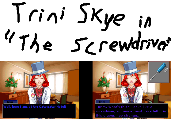
I dunno, that thing sticking out of the drawer in the backround always looked like a screwdriver to me

I know it's short and crappy, but I was just practicing so I could do a real sprite comic
Riu Istina: Annoyed Attorney, here I come!
Re: My First Sprite Comic!


You’re so small in such a big world...
Gender: Female
Location: In front of the computer, where else?
Rank: Ace Attorney
Joined: Sat Apr 26, 2008 2:25 am
Posts: 1720
Avatar drawn by MC_Kitten, edited by Slezak
Re: My First Sprite Comic!


Bwaaah!
Gender: None specified
Rank: Decisive Witness
Joined: Sun Mar 09, 2008 4:42 am
Posts: 236
1. Your title takes up half the page, and is written using a large size of paintbrush. I would cut down on the size of the title, maybe even get rid of it altogether unless it's really crucial to the comic.
2. It's kind of hard to tell when your character here is thinking, as she speaks in blue-ish text the whole time and there are no brackets around thoughts. For easier comprehension and to stay close to the source, I'd have speaking in white and thoughts in blue brackets.
3. You may want that person in the main frame there to move a bit more. But that's getting nit-picky.
You are off to a good start, nice sprite-mixing, you seem to have your test boxes in order and you have a sense of humor. Good luck on Riu Itsina!
GENERATION 22: The first time you see this, copy it into your sig on any forum and add 1 to the generation. Social experiment.
Page 1 of 1
[ 3 posts ]
Who is online
Users browsing this forum: AhrefsBot [Bot?] and 2 guests
You cannot post new topics in this forum
You cannot reply to topics in this forum
You cannot edit your posts in this forum
You cannot delete your posts in this forum
You cannot post attachments in this forum
You cannot reply to topics in this forum
You cannot edit your posts in this forum
You cannot delete your posts in this forum
You cannot post attachments in this forum
